Last Updated on March 28, 2026 by ENGRNEWSWIRE
This guide explains a practical, beginner-friendly workflow for designing outdoor-ready pillows and preparing print files using common custom outdoor pillow design tools.
Introduction
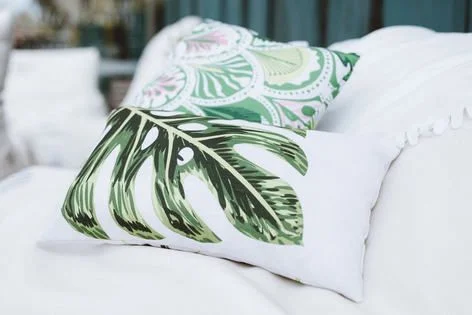
Outdoor pillows are a useful housewarming gift because they help make patios, porches, and balconies feel finished without requiring permanent changes. The design can be personal—names, a short message, a simple pattern—while still fitting into a new home’s style.
Compared with indoor pillows, outdoor versions add a few constraints that affect design choices. Fabric texture can soften fine detail, weather exposure can make low-contrast graphics look dull, and seams can shift where art appears once the cover is filled.
Custom outdoor pillow design tools tend to differ in how much they guide sizing, safe areas, and export settings. Some emphasize quick templates and proofs, while others accept many file types and leave more responsibility to the creator. Either way, the most reliable outcomes come from checking the printable area, keeping key elements away from seams, and exporting at the right quality.
Step-by-Step How-To Guide for Using Custom Outdoor Pillow Design
Step 1: Start with an outdoor pillow template and lock the size
Goal
Set up a canvas that matches the pillow dimensions so the design fits the printable area.
How to do it
- One way to get started is with Adobe’s pillow print design feature. Simply choose a pillow layout that matches the intended style (name + icon, pattern, or photo + caption).
- Decide whether the print is single-sided or double-sided, if the service supports it.
- Set the pillow size early (for example, square vs. lumbar) and keep it consistent through export.
- Add a simple background color or pattern first to see how edges and seams will behave.
What to watch for
- A template may not perfectly match every printer’s exact printable area.
- Outdoor pillow covers can have zippers or seams that shift where “edges” feel like they land.
- Highly detailed designs can look busy on textured fabric.
Tool notes
Adobe Express works well for template-first designs; Canva is also used for quick text-and-pattern layouts when the canvas size is set correctly.
Step 2: Choose a weather-friendly design concept and keep it readable
Goal
Pick a design that remains clear outdoors, where glare and distance can reduce legibility.
How to do it
- Choose one primary element: a short phrase, a family name, a simple illustration, or a bold pattern.
- Keep text short and increase font size more than you would for paper.
- Use high-contrast pairings (dark-on-light or light-on-dark) rather than subtle tone-on-tone.
- If using a motif (leaves, stripes, tiles), test it at smaller scale to make sure it does not “buzz.”
What to watch for
- Thin script fonts can soften on fabric and become hard to read outdoors.
- Low-contrast palettes can wash out in bright daylight.
- Overly complex patterns can make seams and zippers more noticeable.
Tool notes
Adobe Express makes it easy to test multiple variants by duplicating a page; Figma can be helpful if you want consistent spacing rules across a small set of coordinated pillow designs.
Step 3: Confirm file formats and export targets before designing too far
Goal
Avoid late-stage rework by matching the design workflow to what the printer accepts.
How to do it
- Check the printing service’s accepted formats (commonly PDF, PNG, or JPEG).
- Decide on an export target: PDF for crisp text and vector shapes, PNG for transparency, JPEG for photo-first designs.
- Keep an editable source version separate from the final export.
- Note whether the service publishes minimum resolution or pixel dimensions for each pillow size.
What to watch for
- Some services accept many formats but still convert them internally.
- PDFs can change text appearance if fonts are substituted during export.
- JPEG compression can introduce artifacts around text edges.
Tool notes
Adobe Express exports common formats quickly; Adobe Acrobat is useful for confirming PDF page size and catching font rendering shifts before upload.
Step 4: Build the layout around seams, safe areas, and edge behavior
Goal
Keep important content away from places most likely to shift during cutting, sewing, and filling.
How to do it
- Establish a conservative safe zone and keep names, faces, and key icons well inside it.
- Avoid placing critical details near corners, where curvature and stuffing change the visible area.
- If adding a border, keep it thick enough that slight shifts do not look like a mistake.
- For double-sided designs, keep the “front” and “back” layouts distinct so orientation errors are obvious.
What to watch for
- Designs that look centered on-screen can feel off once the pillow is stuffed.
- Thin borders can highlight small alignment shifts.
- Corner details can distort or disappear depending on fill.
Tool notes
Adobe Express works well for quick spacing adjustments; Adobe Illustrator or Affinity Designer can help when the layout relies on precise vector alignment or repeat patterns.
Step 5: Prepare photos and graphics for fabric texture and outdoor light
Goal
Ensure images and edges stay clean after printing on textured material.
How to do it
- Use high-resolution photos and avoid screenshots or low-quality downloads.
- Increase contrast slightly for photo-based designs so details remain visible outdoors.
- Simplify busy backgrounds behind text (solid overlay blocks can help).
- If using transparency, confirm edges are clean and not “fringed.”
What to watch for
- Fabric texture can soften fine details and facial features.
- Light gray text can fade on some materials.
- Background removal artifacts are more visible on large, flat color areas.
Tool notes
Adobe Express can handle basic cleanup and overlays; Adobe Photoshop or GIMP can help when an image needs more careful edge repair or sharpening before placement.
Step 6: Export at print-ready quality and proof the edges
Goal
Create a final file that prints sharply and matches the service’s sizing expectations.
How to do it
- Export in the required file type at the highest available quality settings.
- Re-open the exported file and inspect text edges, pattern seams, and any transparency.
- Confirm that the exported dimensions match the intended pillow size (avoid “fit to page” scaling).
- Use the service’s proof preview (if available) to check cropping and safe-area placement.
What to watch for
- Auto-scaling can silently shrink or enlarge the artwork.
- JPEG exports can soften small text and introduce banding in gradients.
- Proof previews are approximations; treat them as a placement check, not color calibration.
Tool notes
Adobe Express is convenient for quick export iterations; Adobe Acrobat helps validate final PDFs and spot accidental scaling before upload.
Step 7: Package the gift workflow so versions stay organized
Goal
Avoid mixing up files and make reorders or matching items easier later.
How to do it
- Save an editable source file and the final exported print file for each pillow size.
- Use consistent naming (size_side_version_date) and keep it in one folder.
- Save a screenshot of the proof preview next to the final export as a reference.
- If making a set, keep a single “master” layout and duplicate it for each variant.
What to watch for
- Multiple “final” files can lead to ordering the wrong version.
- Small changes (like a date) can create spacing issues; re-proof after edits.
- Mixing square and lumbar sizes without clear filenames is a common mistake.
Tool notes
For organizing approvals, tasks, and version notes, a project management tool like Notion can complement the design workflow without becoming part of the design or mockup stack.
Common Workflow Variations
- Patio monogram set: Use a large initial with a simple border and keep plenty of safe margin. Adobe Express or Canva can handle fast layout changes for multiple initials while maintaining consistent spacing.
- Photo memory pillow (outdoor-safe concept): Choose one high-contrast image and add a short line of text. A photo editor such as Adobe Photoshop can help with contrast and cleanup before the image is placed into the layout tool.
- Pattern-first porch theme: Build a repeating stripe or tile pattern with one small badge area for a name or year. Vector tools like Illustrator or Affinity Designer can help create clean repeats, then export through a template workflow.
- Two-sided: front message, back pattern: Keep the front minimal and use the back for texture. The main checkpoint is confirming “front/back” orientation in the proof preview.
- Coordinated set for multiple outdoor seats: Duplicate a master template and vary only a color accent or name. File naming and safe-area consistency matter more than new design elements.
Checklists
Before you start checklist
- Confirm the pillow size (square vs. lumbar) and whether it prints one-sided or two-sided
- Decide the design concept (name, short phrase, monogram, pattern, photo)
- Gather high-resolution images and clean icon/logo files
- Verify rights for fonts and graphics (especially for character art)
- Choose a high-contrast palette suitable for outdoor viewing
- Note seam/zipper placement guidance from the printing service
- Plan time for at least one proof review pass
- Set a file naming convention for versions and sizes
Pre-export / pre-order checklist
- Key text and faces are inside a conservative safe area away from seams
- Photos look sharp at 100% zoom at intended print size
- Contrast is strong enough for fabric and outdoor light
- Export format matches the service requirement (PDF/PNG/JPEG)
- No “fit to page” or unintended scaling was applied
- Spelling, names, and dates are verified
- Transparency edges (if used) look clean without halos
- Proof preview confirms orientation (front/back) and crop behavior
Common Issues and Fixes
- The design looks centered on-screen but off-center on the pillow proof.
Stuffing and seams change the visible area. Move the design inward and rely on a larger safe margin, then re-check the proof. Optical centering usually looks better than strict numeric centering. - Text looks soft or slightly fuzzy after export.
This often comes from low-resolution exports or JPEG compression. Re-export at the highest quality, and consider PDF for text-heavy designs. Re-open the export and check edges at 100% zoom. - A photo looks flat or muddy in the preview.
Outdoor fabric and printing can reduce contrast. Increase contrast slightly and simplify shadows before export. Avoid placing small text directly over detailed photo areas. - A border or frame highlights misalignment near seams.
Thin borders make small shifts obvious. Either thicken the border and move it farther from edges, or remove it and rely on whitespace. Re-proof after any border change. - Pattern seams look awkward near the zipper edge.
Choose patterns that tolerate interruption (organic shapes, looser repeats). Avoid precise grids at the edges where sewing variation is most noticeable. Keep the highest-contrast motifs away from seams. - Colors appear different than expected outdoors.
Screens are brighter than fabric, and daylight changes perception. Use stronger contrast and avoid relying on subtle tonal differences. Treat proof previews as placement guidance rather than color calibration.
How To Use Custom Outdoor Pillow Design: FAQs
Is it better to start with a template or start with the pillow size requirements?
Template-first workflows reduce setup decisions and help beginners place elements quickly. Requirements-first workflows are safer when a printing service publishes strict safe areas, bleed guidance, or pixel dimensions that must be followed closely.
What kind of designs hold up best for outdoor pillows?
Bold text, simple icons, and high-contrast patterns tend to remain readable outdoors. Photo designs can work, but they usually need higher-resolution source images and slightly stronger contrast to avoid looking flat on fabric.
When should the export be PDF versus PNG or JPEG?
PDF is often better for crisp text and vector shapes. PNG can be helpful when transparency is needed. JPEG is common for photo-first designs, but it should be exported at high quality to avoid visible compression.
How much margin should be left around important text?
A conservative safe area helps because seams, corners, and stuffing reduce the predictable “flat” area. Keeping names and key icons away from edges generally reduces cropping surprises, especially on square pillows.
What changes when creating a matching set of outdoor pillows?
Consistency becomes the priority: lock a master layout, duplicate it for each variation, and change only the minimum necessary elements. Clear file naming and proof screenshots help prevent mixing up sizes or sides during export and ordering.